|
|
Post by Moon on Apr 18, 2016 19:10:34 GMT -5
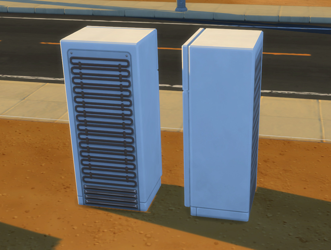
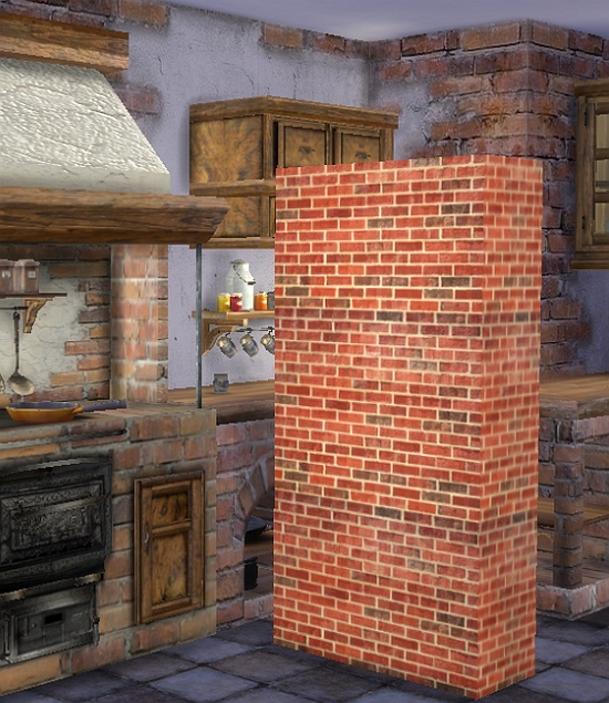
Hi everyone, so I'm following the mesh tutorial for beginners from this forum, I choose a very simple mesh, an half wall, and everything seemed to work fine until I entered in game, there I noticed that part of my texture shows up blurred, like you can see in this picture:  Any ideas how can I fix that? Also, for this mesh I cloned a statue (that dog one) and when I place one next to each other, I get that shadow problem, as I could see this object doesn't have occluders but maybe I looked in the wrong place, I remember seeing a tutorial here on how to fix this but I couldn't find it, can someone point it to me again? |
|
|
|
Post by eronoel on Apr 18, 2016 20:32:13 GMT -5
I am not 100% sure, but I think that the blurring is just the game mechanics. I see that in a lot of things in my game when you view them kind of from the side (so straight on they look clear, but at an angle they are blurry), especially things with lots of details. If it is blurry when you look at it straight on that could be another thing like maybe you need to make its portion of the UV map larger or maybe make sure that it is projected nicely on the uv map because that can provide distortion too.
As for the shadow, not sure what you mean by "that shadow problem" - can you provide a little more detail and I'll try to point you in a shadowy direction.
|
|
|
|
Post by orangemittens on Apr 18, 2016 20:38:04 GMT -5
If the above answer doesn't solve the problem please post your .package and .blend so someone can take a look. I cannot tell from the pictures but there could be a normals problem going on.
|
|
|
|
Post by Moon on Apr 18, 2016 20:41:34 GMT -5
eronoel as far as I can tell, the uv map is fine, but I could be wrong? I have noticed some "stretched out" textures on some objects in my game but this kind of blur is the first time :( As for the shadow problem, you know like how when you place some objects like table next to each other and they look different? like a shade difference in the texture. the only item that really doesn't have this issue in the game are counters I believe So here's the package orangemittens
|
|
|
|
Post by orangemittens on Apr 19, 2016 8:28:23 GMT -5
Hi dreamtimesims, the link you posted is giving me a file not found type of error message.
|
|
|
|
Post by j on Apr 19, 2016 12:14:44 GMT -5
The blur definitely occurs with every object in the game, it's just how perspective works, especially on detailed textures.  |
|
|
|
Post by eronoel on Apr 19, 2016 14:56:21 GMT -5
Sorry dreamteam... I haven't encountered that shadow problem yet, but now I get what you were saying - you want them to look like one continuous piece and not look like there is a differing shadow? I am afraid I will have to leave that to a more experienced simmer. Although if I find the tutorial for it; I'll send it your way  |
|
|
|
Post by Moon on Apr 19, 2016 15:04:02 GMT -5
orangemittens I'm sorry here's the right link in case you want to check it out but it seems like the problem is just how the game render all the objects :/ j Yeah, I was hoping that I could go way through that somehow? I even tried to clone dif items but turns out it really is just how the game render objects :( eronoel It was one about removing occludders, but it's okay, a friend of mine linked me to another one and it was very helpful as well ^_^
|
|
|
|
Post by Asyli on Apr 19, 2016 17:43:16 GMT -5
The same problem with my Brick Kitchen. I think it is extremely at Brick. It is mysterious it is not always. I think it could be the game .  |
|
|
|
Post by MisterS on Apr 19, 2016 18:01:27 GMT -5
Issue occurs because the texture is a 2d object, when viewed on an angle it looses detail, bump maps minimize it though.  |
|
|
|
Post by Asyli on Apr 19, 2016 18:25:27 GMT -5
Thank you MisterS  is it also the light in the game ?It is not always so |
|
|
|
Post by MisterS on Apr 19, 2016 20:02:53 GMT -5
Im not sure on that Asyli, the light in the game is dodgy imo.
|
|
|
|
Post by brujah on Apr 20, 2016 1:17:43 GMT -5
The solution to the shadows is a simple mesh edit.
First remove doubles on the entire mesh so you end up with 4 vertexes.
Next choose edge mode and select only the edges that need to have a hard angle then edge split them.
Save and reimport.
|
|
|
|
Post by j on Apr 20, 2016 9:57:54 GMT -5
j Yeah, I was hoping that I could go way through that somehow? I even tried to clone dif items but turns out it really is just how the game render objects :( You can minimize it through a good specular and bumpmap, as suggested, but it's just one of those things. I don't think anyone will mind, it's probably extra noticeable to you since it's your CC and you as a creator tend to be the most critical when it comes to your content. The first time I noticed the side blur was on a piece of my CC too, and only later began to see it on EA objects as well. |
|
|
|
Post by Moon on Apr 20, 2016 12:44:17 GMT -5
brujah I did split the edges, it's a very basic mesh so there's no doubles :/ MisterS I will try to make a good bump map to see if it gets better! j It's possible, but tbh it's also because I want this wall for decoration purpose so if it doesn't look good it's pointless yk :/
|
|