snowtato
Member
 simsnowtato.tumblr.com
Posts: 49
|
Post by snowtato on May 20, 2017 18:26:13 GMT -5
Hi everyone! I'm reworking the basegame Plumbobs poster mesh to have higher resolution textures and better size options. The original comes with a shiny specular that is supposed to simulate the glass in the frame. It's very pretty in game, but in screenshots it tends to make the art look washed out and/or super bright. What do you guys think? Should the specular stay or go?Thank you in advance.  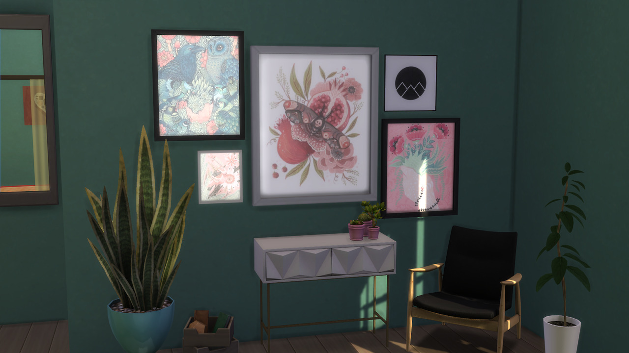 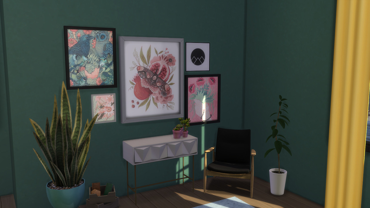 |
|
|
|
Post by araviss on May 21, 2017 11:11:49 GMT -5
I myself prefer it without the specular, its more cartoonish (and i have very maxis-match game). But with that specular, it looks more realistic, so people who dont want to have only maxis-match could use it too.
So basically, I wouldn't be able to decide either :D
|
|
|
|
Post by freeasabird on May 21, 2017 17:31:48 GMT -5
I too like the non shine version. I have not ever given any thought to glass in pics so thanks for posting this I will check next time I make any pictures |
|
snowtato
Member
simsnowtato.tumblr.com
Posts: 49
|
Post by snowtato on May 22, 2017 7:25:29 GMT -5
Thank you both! I agree, the non-shine is more photogenic and Maxis Matchy (even though Maxis put the shine there to begin with, lol). Thank you for your feedback! That was just the boost I needed to finish this project. :D
|
|
|
|
Post by inabadromance on May 22, 2017 16:13:21 GMT -5
There's plenty of EA items that have that same specular. What you can do is tone it down until you're happy by editing the alpha channel of the specular texture. I too find it annoying when trying to take pictures when glass gets in the way.
|
|


