|
|
Post by redmallie on Jul 29, 2023 13:31:48 GMT -5
Hello.
Please excuse me if this is not the right thread.
I was searching for a thread to post about observations on S4S, not errors, but could not find one.
I am using S4S 3.2.1.0 Star. I tried to check the cc I use to have feminine or masculine tags? (are they called that?).
I wear glasses and the ticks for all customizable options are really light, almost invisible; this makes it very difficult to see if the box I want to check is indeed checked.
Is it possible to change this in the settings in S4S? Make those ticks darker?
If not, would it be possible to have a version that has darker ticks, please?
Thank you very much!
|
|
|
|
Post by mauvemorn on Jul 29, 2023 13:55:28 GMT -5
Hi. Could you please send s screenshot of the issue?
|
|
|
|
Post by redmallie on Jul 29, 2023 18:44:35 GMT -5
Sorry it look me this long. Sure. Here it is. [img src=" ![]() s12.gifyu.com/images/Sck28.png s12.gifyu.com/images/Sck28.png" src=" " alt=" "] I usually never change the standard or classic colors of S4S, but I tried the dark colors to see if the issue was less uncomfortable. I found that it is not really better for me. Thank you for replying. |
|
|
|
Post by mauvemorn on Jul 29, 2023 18:45:50 GMT -5
Thank you, I will notify the developers about this
|
|
|
|
Post by redmallie on Jul 30, 2023 17:21:26 GMT -5
Not to bother you all, but I set S4S back to the classic mode, which is the one I prefer. The issue I mention about the ticks or cheks is much more obvious here. I have a picture to show. 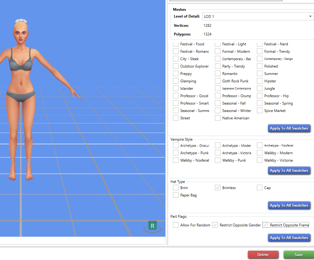 |
|
|
|
Post by mauvemorn on Jul 30, 2023 17:48:30 GMT -5
I have informed the developers in suggestions and they saw it, so I’m sure it will be fixed in the next update. For now you can try using a community tested version (although I do not remember if it’s any different). Wishes and Star can co-exist, so you don’t have to delete either
|
|
|
|
Post by S4Player on Jul 30, 2023 20:05:47 GMT -5
I have a problem with these checkmarks visibility too, and I really hope that this can be fixed because I also prefer the classic look, and in wishes the check mark visibility is black and much better.
|
|
|
|
Post by redmallie on Jul 30, 2023 22:49:28 GMT -5
Thank you very much, mauvemorn ! It is very useful to know that both versions can be used. Wishes did have much darker marks and that was easier on my eyes. |
|
|
|
Post by shkatzchen on Jul 31, 2023 23:28:01 GMT -5
Hello, I have Star (3.2.0.6) and under the "classic" skin the tickmarks are pretty light, so it's been that way for a little while now. I think it's because the tickmarks seem to be tied to the same color as the tab and the header bar, which under "classic" is a light gray. redmallie, did you try the "steel (light)" skin? It makes the header and the tab areas a darker gray with white writing, which might take a little adjustment to, but the tickmarks are much darker, providing a higher contrast. |
|
|
|
Post by redmallie on Aug 2, 2023 17:12:42 GMT -5
Hello, shkatzchen . Thank you for your suggestion. I had not tried that. I explored that one and other themes, and indeed, that theme, as well as others, show darker tickmarks, which is much more comfortable for my eyes. To be honest, it is a bummer that the classic theme, which I prefer, is not useful to me any more because of those very light tickmarks, but I appreciate that there are some other options that can be useful. If there ever is an update that makes the classic theme useful again, I will gladly go back to it, but for now, I will be using that Steel light theme or the Taupe light one. Thanks again! As a personal note, Sims4Studio is a jewel that I have come to cherish tremendously. Thank you very much to the generous developers who work on it. |
|


