Post by katybug273 on May 2, 2017 4:16:05 GMT -5
I'm somewhat thick skinned usually. I appreciate when critiques are constructive and give a clear goal about how to fix what isn't working and that the issue is a genuine issue not just that I made it yellow and you really, really, really want it in pink.
Background:
In order to grow a following I've used MTS to upload to after I use S4S to do the recolor. My MTS numbers are fantastic & my own Tumblr numbers not so much. After my last upload there I dreaded the process. (Not constructive critique BUT the nit picky things like I'd prefer to have this in a different color so that I had to add on to the intended item)
But again, this time I felt like I needed to go that route. I'm sure there are SOME issues with this but are they as bad as I was told today?
Designing in general is different than designing in TS4 and I'm 100% sure I could still benefit from helpful comments as I genuinely desire to improve. That's why I'm posting here. I recognize not everyone's going to love everything and that's okay but I felt like this was less about guiding me in the right direction and more about not liking my graphic choices in general or the colors I had chosen. And while 1 dress was well received, the other with the exact same color had color problems.
Which is funny as I use these in my paid business and I feel the problems are conversion from a large png that I use on a tshirt to a teeny tiny item that I use in a game. I do think maybe, the stretched problem is that I didn't make the main image small enough? It's still wrapped too much around Sim?
Things I'd like to avoid hearing a second time, as this was in the critique already received(unless you can decode some of this for a noobie):
there is only one design that even looks good really (flowers)
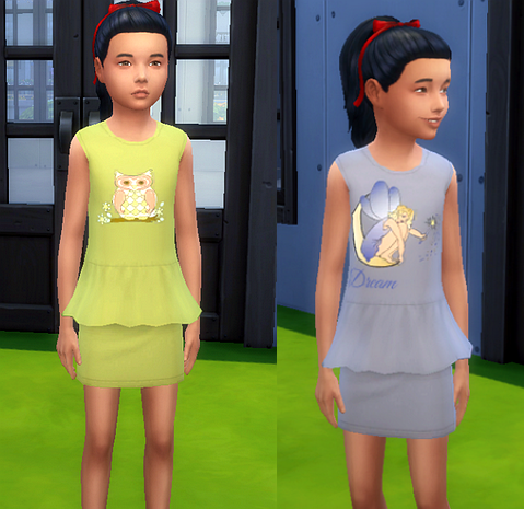
The brown and olive are okay, but could use more work as well. The blue is definitely the best, at least as far as the stencil. The owl is next, and the brown dress is just saturated well generally.
The clothing is actually not saturated really well, and is kind of blurry
The textures are somewhat too saturated.
Look closely at the original recolors, and compare the ruffle to your ruffle..I would suggest adding texture there at the very least.
(did this and on my png files all the detail from the mesh I was using is there. Same in S4S. Same in my game. It is a little lost in my screenshots which is fixable because all my screenshots are bad anyway)
Honestly, I swear I want critique's, I don't need kid gloves but I'd rather not feel like crying because it's just ugly, except for 1 design. Which is how that statement read to me. I only included the cream of the crop in my post here, there was more. And I'm probably sensitive because of the process I went through the last time I uploaded there but I'm beginning to think perhaps, I should have left CC up to those of you already doing a fantastic job at it and just go back to enjoying my game
Girl's Spring Dresses
Background:
In order to grow a following I've used MTS to upload to after I use S4S to do the recolor. My MTS numbers are fantastic & my own Tumblr numbers not so much. After my last upload there I dreaded the process. (Not constructive critique BUT the nit picky things like I'd prefer to have this in a different color so that I had to add on to the intended item)
But again, this time I felt like I needed to go that route. I'm sure there are SOME issues with this but are they as bad as I was told today?
Designing in general is different than designing in TS4 and I'm 100% sure I could still benefit from helpful comments as I genuinely desire to improve. That's why I'm posting here. I recognize not everyone's going to love everything and that's okay but I felt like this was less about guiding me in the right direction and more about not liking my graphic choices in general or the colors I had chosen. And while 1 dress was well received, the other with the exact same color had color problems.
Which is funny as I use these in my paid business and I feel the problems are conversion from a large png that I use on a tshirt to a teeny tiny item that I use in a game. I do think maybe, the stretched problem is that I didn't make the main image small enough? It's still wrapped too much around Sim?
Things I'd like to avoid hearing a second time, as this was in the critique already received(unless you can decode some of this for a noobie):
there is only one design that even looks good really (flowers)
The brown and olive are okay, but could use more work as well. The blue is definitely the best, at least as far as the stencil. The owl is next, and the brown dress is just saturated well generally.
The clothing is actually not saturated really well, and is kind of blurry
The textures are somewhat too saturated.
Look closely at the original recolors, and compare the ruffle to your ruffle..I would suggest adding texture there at the very least.
(did this and on my png files all the detail from the mesh I was using is there. Same in S4S. Same in my game. It is a little lost in my screenshots which is fixable because all my screenshots are bad anyway)
Honestly, I swear I want critique's, I don't need kid gloves but I'd rather not feel like crying because it's just ugly, except for 1 design. Which is how that statement read to me. I only included the cream of the crop in my post here, there was more. And I'm probably sensitive because of the process I went through the last time I uploaded there but I'm beginning to think perhaps, I should have left CC up to those of you already doing a fantastic job at it and just go back to enjoying my game

Girl's Spring Dresses


